

2.4 Visuals and Arts
2.4.1 Advanced Visualisation
Tobias Blanke, Data Visualisation in Python (YouTube)
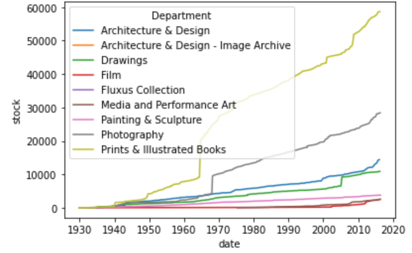
 It is time to visualise and organise data into graphs. We have already done this, of course, but we will take a more systematic look in this session.
We use the same libraries as before, but a new library is also introduced: Seaborn. Seaborn is a more recent Python data visualisation library based on Matplotlib. According to https://seaborn.pydata.org/, it ‘provides a high-level interface for drawing attractive and informative statistical graphics.’ It integrates easily with Pandas and provides an easier-to-use set of high-level functions.
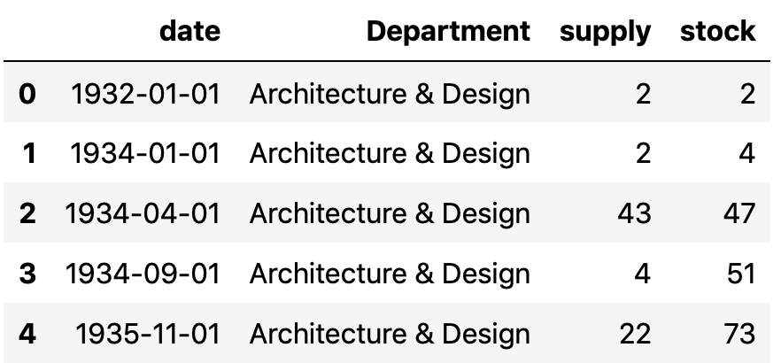
In the notebook in Google Colab, we look at museums and how to get a job as an analyst there. Several art museums around the world publish their collections’ metadata online. Very popular is, for instance, New York’s Museum of Modern Art (MoMA) collection data (https://github.com/MuseumofModernArt/collection).
REFERENCES
- The Museum of Modern Art (MoMA) Collection. (2023). MoMA. https://github.com/MuseumofModernArt/collection (Original work published 2015)
. The Museum of Modern Art (MoMA) Collection. . . 12-03-2023.
- Waskom, M. (2021). seaborn: Statistical data visualisation. Journal of Open Source Software, 6(60), 3021. https://doi.org/10.21105/joss.03021
Michael Waskom. seaborn: statistical data visualization. Journal of Open Source Software. 60. 06-04-2021.