

4.1. Sentiment analysis on Twitter
4.1.4. Results
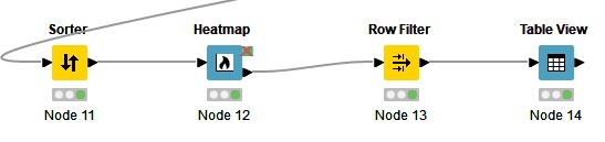
We start by connecting a Sorter node, which will allow us to sort our data table by the sentiment scores. This creates a table where our tweets are shown in order from negative to positive. We then connect this Sorter node to a Heatmap node. This gives us a visualisation of the sentiment in our tweets, as seen below.
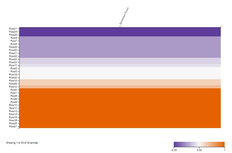
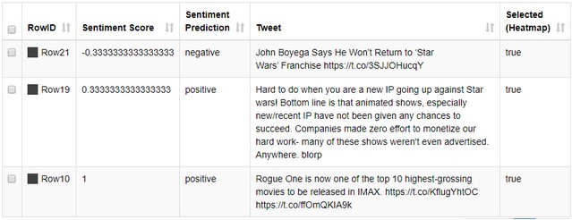
The truly beautiful thing about KNIME's Heatmap node is that it allows us to select the visualized data rows and output them. So, we connect our Heatmap to a Row Filter node to sort out the relevant columns, and then we can enjoy our curated selection in a Table View node. We can use the Heatmap to select positive, negative or neutral data in order to see what is in each category, perhaps through topic modelling. We could also pick one row from each in order to see what has been identified as what. One such selection from our "Star Wars" query is shown below.
Being able to perform sentiment analysis on data from Twitter according to a search query is a powerful tool if you are interested in looking at public opinion or discourse. You could, for instance, access tweets about a specific product launch or a recent political event to see how the discussion is carried out. The use case shown here provides us with a data table of the results, and it could easily be connected to further exploratory processes in KNIME or exported for use in a different tool.