Data Feminism
This case study is written by Anna Villarica and is based on the book 'Data Feminism' by Catherine D'Ignazio and Lauren F. Klein.
What is data feminism?
Data feminism is the application of intersectional feminist approaches to data science. It is a framework developed by digital humanities scholars Catherine D’Ignazio and Lauren F. Klein. In their book ‘Data Feminism’, they define it as ‘a way of thinking about data that is informed by direct experience, commitment to action, and intersectional feminist thought’ (D’Ignazio and Klein, 2020). Recognising the inequalities produced and reinforced in different stages of working with data, D’Ignazio and Klein argue for a more thoughtful and reflexive way of conducting data science work.
To this end, they outline seven principles to operationalize feminism in the data sciences. These principles focus on transparency, accountability, and recognize not only the biases that feed into the data, but also the potential of using data science to challenge power. Data feminism is part of a larger push for social justice in the digital humanities. Digital humanities scholars have always worked at the intersection of the digital with humanist concerns. With emerging technologies, they are afforded new opportunities for conducting research, as well as new ways to use these tools to advance important causes.
Click the hotspots to find out how digital scholars are using their work to advance social justice.
Why data?
Data has been called the new oil. Oil-related metaphors and vocabulary abound – data is a resource that can be ‘mined’, ‘processed’ and turned into profits. Powerful institutions that have the resources to harvest data can use it to their benefit. For instance, large companies like Google and Amazon are able to work with data to send targeted ads to their users. Government institutions are also able to collect and access data on citizens and base their decisions and expenditures on those. Those who hold the data wield power, similar to nations with vast amounts of oil resources at their disposal.
Data is also like oil in that it can worsen inequalities. In some cases, the discovery of oil can lead to exploitation and worse conditions for the local populations while oil companies make money. Likewise, inequalities can also arise when data procedures are applied on certain people. When data is collected on vulnerable populations, for example, it can lead to categorization and further stigmatization of such groups, at the same time benefiting the people holding the data. Algorithms based on big data have been found to be biased towards people of a certain gender or race, for example (Noble 2018; O’Neil, 2017).
Data may be gold, but who is harmed? (Listen to the Data Fails Podcast on Spotify)
Ali Dunn and Jade Greer of the Data Feminism Network discuss how data has been used or misused.
Applied to recruiting, the car industry, welfare and more, consequences range from hilarious to disastrous.
At the same time, people tend to see data as neutral, objective and fair as they are based on numbers. Data feminists note however that data are not as objective as they appear. For D’Ignazio and Klein, a data visualization is an example of a ‘rhetorical object’ which is ‘a communicating object that reflects choices about the selection and representation of reality’ (2020, p. 78). After all, data are produced through processes of collecting, selecting, processing, interpreting and visualizing phenomena. These social contexts that give rise to that data should not be neglected. Choices are made by humans throughout these steps, leading to datasets, algorithms and visualisations that may be based on numbers, but reflect the opinions, beliefs, and biases of those who interacted with data. Given that only 15% of people in data science and analytics are female and less than three percent are people of colour (Duranton et al.,2020), we should be concerned.
Why feminism?
"Intersectional feminism, when applied to the unequal balance of power in data science, can help that power be challenged, can help it be rebalanced, and ultimately help it be changed’" -Lauren Klein
Feminism is concerned with equal rights for all genders. Beyond being a gender-related issue, however, feminism is concerned with power imbalances and what structural forces have caused them over a long period of time. The goal of feminism is to understand and challenge these power systems to achieve equality. Data feminism borrows from intersectional feminism in particular. Intersectional feminism, borne out of Black feminism, believes that forces of power intersect with each other and the processes of discrimination that result are complex. Structural forces contribute to discrimination or privilege which we experience, based on various factors like gender, class, race, religion and so on. These result in interlocking systems of oppression that become difficult to separate and compound each others’ effects. Data science practices likewise result in issues of inequality, power and representation, so it makes sense to apply intersectional feminist theories to them. D’Ignazio and Klein build their data feminism framework around seven principles which serve as best practices to guide people working with data.
Case #1 Missing data and counterdata
(Principles 1,2,5)
Data feminist practice begins by examining power structures and how that is reflected in our data and data practices. For example, what types of data are collected or not, or which ones are made publicly available, could say a lot. In our data-saturated landscape, there are datasets that are conspicuously absent. Artist Mimi Onouha examines this in her installation: The Library of Missing Datasets. Onuoha’s exhibit is a physical drawer that contains the types of data that governments choose not to spend resources on, or choose to hide. As Onuoha notes, ‘Wherever large amounts of data are collected, there are often empty spaces where no data live…That which we ignore reveals more than what we give our attention to...Spots that we've left blank reveal our hidden social biases and indifferences’ (Onuoha, n.d.).
Beyond examining power, research-activists are also actively using data to challenge or ‘counter’ this power. Such ‘counterdata’ practices could include compiling data sheets, publishing maps, digital storytelling and more. One concrete example is the feminicide map started by Maria Salguero in Mexico. Feminicide is the killing of women or girls due to their gender. In Mexico, an average of eight girls are killed each day. While the Mexican government has promised to clamp down on feminicide, it neglects to count and register such cases and their official feminicide data are not available in disaggregated form (D’Ignazio, 2022). Maria Salguero, a human rights activist and geophysical engineer from Mexico, decided to collect and map the data herself. She spends about three hours a day poring through sources, verifying and structuring the data in order to be able to plot them on the map. This grassroots project also involves the public (non-data experts) who can send information to Salguero. Her unofficial database is the largest publicly accessible dataset on feminicide in Mexico, helping families find missing women, supporting the work of journalists and nonprofits, and making the victims’ stories visible (D’Ignazio, 2022). Salguero’s work challenges power and contributes towards justice for the victims.
Slide to see two ways in which the issue of neglected datasets were brought to light.
One is by artist Mimi Onuoha and the other is by engineer Maria Salguero.
Case #2 Emotional and multi sensory data
(Principles 3,5)
In data visualization, what is missing are ‘emotion and affect, embodiment and expression, embellishment and decoration’ as these experiences have been ascribed to women and thus not as valued in society (D’Ignazio and Klein, 2020). We have been trained to put reason on top of emotion, and as a result data visualizations often have clean layouts, 2D and minimalist designs. D’Ignazio and Klein ask: What happens when we allow emotions back in? They advocate for the ‘visceralisation’ of data – that is, to make data that we can respond to physically and emotionally.
D’Ignazio and Klein use the example of US Gun Killings visualizations to illustrate the impact of emotional data. Rather than a static visualization, this uses arcs to represent someone’s life, starting with a bright orange line, growing and growing, until the point at which they are shot and killed, turning the line to grey. Each represents a life cut short due to gun violence, and a cumulative ‘Stolen Years’ dashboard counts (based on data about potential lifespans) how many years these people as a whole did not get to enjoy. Visualisations such as these stick with viewers, as they combine reason and emotion. However, they are sometimes viewed with skepticism due to their emotional appeal. 
Gif credit: Benjamin Wiederkehr, from data in https://guns.periscopic.com/
Data is also often presented in textual 2D formats. What happens when data is turned into objects we can touch? Representing data in physical form is called data physicalization (Jansen et al., 2015). Being able to touch data also brings a different, more intimate experience of the object. Data physicalisation blurs the lines between creative, physical and conceptual exploration, ‘surfaces the labor involved with data production and representation’ (Koeser et al., 2020, p. 2), provides different perspectives and dimensions to the data, and allows the people interacting with it to be active participants (Koeser et al., 2020).
This also allows more people into the realm of data science, which ties in with feminist principle five: Embracing pluralism. Through presenting data in multisensory formats, differently abled people could also participate in data science. Non-data experts such as artists and sculptors could also contribute to data science. With this, it is possible to expand our definition of data science, by bringing in the perspectives of individuals who may not be data practitioners per so, but who could contribute different ways of knowing and experiencing. Below are examples of physicalised data from the Gallery of Physical Visualizations maintained by Pierre Dragicevic and Yvonne Jansen. 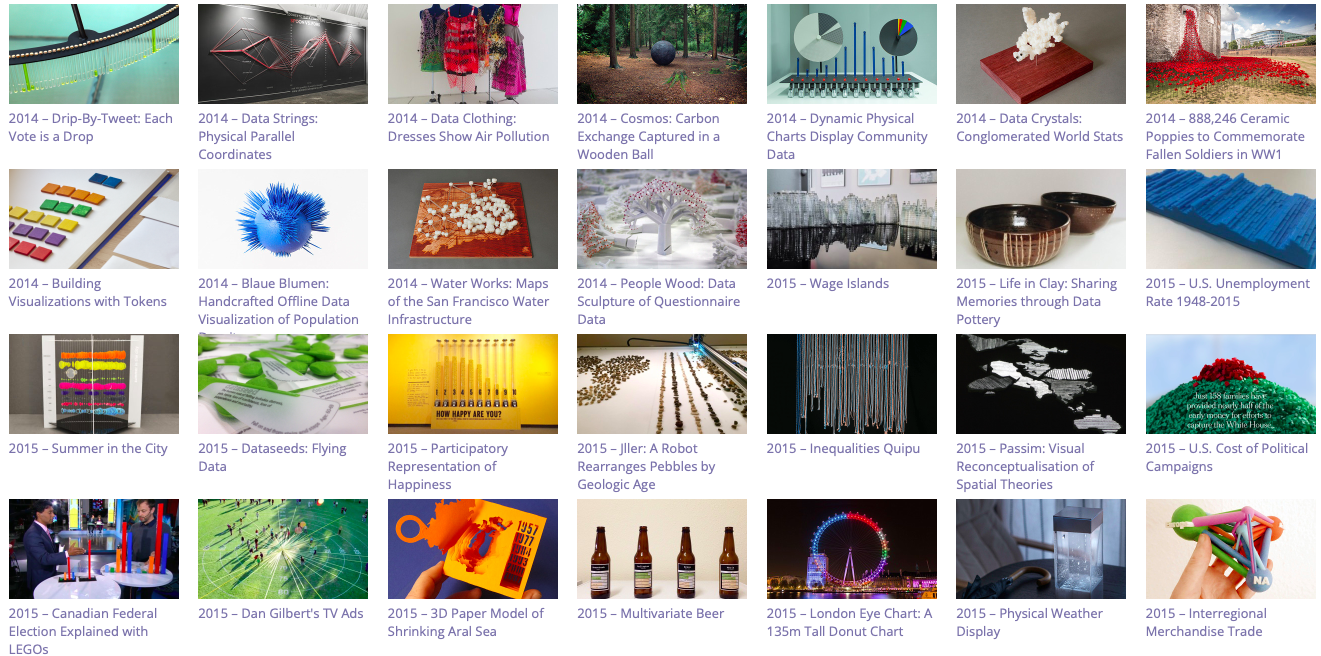
Explore more applications of feminism in data science
Author Bio: Anna Villarica is a research assistant on the #dariahTeach project. She is a junior lecturer at Maastricht University currently teaching courses on design thinking, digital transformations, the philosophy of technology, research skills, and museology. She received her MA in Media Studies Digital Cultures from Maastricht University and her BA in Communications and New Media from the National University of Singapore. While she does not specialise in anything (yet), she loves all things digital and is always learning and creating.
References
- Cho, Eunsun. “The Social Credit System: Not Just Another Chinese Idiosyncrasy.” Princeton Journal of Public & International Affrairs: News. May 1, 2020. https://jpia.princeton.edu/news/social-credit-system-not-just-another-chinese-idiosyncrasy/.
- Dastin, Jeffrey. “Amazon scraps secret AI recruiting tool that showed bias against women.” Reuters. October 11, 2018. https://www.reuters.com/article/us-amazon-com-jobs-automation-insight-idUSKCN1MK08G/.
- D’Ignazio, Catherine. Counting Feminicide: Data Feminism in Action. Cambridge, Massachusetts: The MIT Press, 2022.
- D’Ignazio, Catherine, and Klein, Lauren. Data Feminism. Cambridge, Massachusetts: The MIT Press, 2020.
- Dragicevic, Pierre, and Jansen, Yvonne. “Gallery of Physical Visualization and Related Artifacts.” Accessed April 5, 2023. http://dataphys.org/list/gallery/.
- Duranton, Sylvain, Erlebach, Jorg, Brege, Camille, Danzinger, Jane, Gallego, Andrea, and Pauly, Marc. “What’s Keeping Women Out of Data Science?” Boston Consulting Group. March 6, 2020. https://www.bcg.com/publications/2020/what-keeps-women-out-data-science/.
- Jansen, Yvonne, Dragicevic, Pierre, Isenberg, Petra, Alexander, Jason, Karnik, Abhijit, Kildal, Johan, Subramanian, Sriram, and Hornbæk, Kasper. “Opportunities and Challenges for Data Physicalization,” in CHI ’15: Proceedings of the 33rd Annual ACM Conference on Human Factors in Computing Systems (April 2015): 3227–36. https://doi.org/10.1145/2702123.2702180/.
- Koeser, Rebecca Sutton. “What If You Could Touch Data?” Medium. December 7, 2020. https://medium.com/nightingale/what-if-you-could-touch-data-9c3a82a73407/.
- Koeser, Rebecca Sutton, Doroudian, Gissoo, Budak, Nick, and Li, Xinyi. “Data Beyond Vision,” in Transformations (October 2020): 1–4. http://doi.org/10.5281/zenodo.3713671/.
- "Netherlands: We sense trouble: Automated discrimination and mass surveillance in predictive policing in the Netherlands.” Amnesty International. September 29, 2020. https://www.amnesty.org/en/documents/eur35/2971/2020/en/.
- Noble, Safiya Umoja. Algorithms of Oppression: How Search Engines Reinforce Racism. New York: New York University Press, 2018.
- O’Neil, Cathy. Weapon of Math Destruction: How Big Data Increases Inequality and Threatens Democracy. London: Penguin Books, 2017.
- Onuoha, Mimi. “The Library of Missing Datasets (2016). Accessed April 5, 2023. https://mimionuoha.com/the-library-of-missing-datasets/.
- Weissmann, Jordan. “Amazon Created a Hiring Tool Using A.I. It Immediately Started Discriminating Against Women.” Slate. October 10, 2018. https://slate.com/business/2018/10/amazon-artificial-intelligence-hiring-discrimination-women.html/.